
RadGrad with Meteor
It’s been an interesting experience building a new application from the ground up. This time I helped to build an MVP for RadGrad, an application that is designed to help students go succeed in their their Computer Science and Computer Engineering curriculum.
I’ve been privileged to have been involved in leadership positions for three student groups on campus - it was also interesting to follow the development of software that is supposed to help people through an organization. In this case, the organization is the school.
The Path
Roughly, this is the path that we followed for the application:
- Introduction
- Data Model
- Visual Design
- Mockups
- MVP
What surprised me was the significant amount of spool up time that it took me and the rest of the students in my course needed. Dr. Johnson already had a good idea of what RadGrad should look like (evident from the details on http://radgrad.org/ ) but everyone else needed some time to warm up to the idea.
We spent quite some time this semester on the visual design aspect - something that’s a little harder to come by in a more technical field. I’m glad for the opportunity, even though I realize that I’m horrible at most visual design. For web applications, the visual design seems to really drive the development of the product just as much as the data model.
Overview
We only have a few main pages that are presented upfront to the user, for good reason. The MVP needed to be built fast enough so we simply did not have that much time to implement other pages or features beyond the core feature.
Landing Page

The landing page is pretty standard - it describes the product and how it might bring value to others. One notable feature that we added on this page was the ability to over-ride the CAS that is hooked into the application.
To be fully honest, I had issues hooking into my university’s CAS, but such a feature would probably be useful for someone who is maintaining the application.
User Page
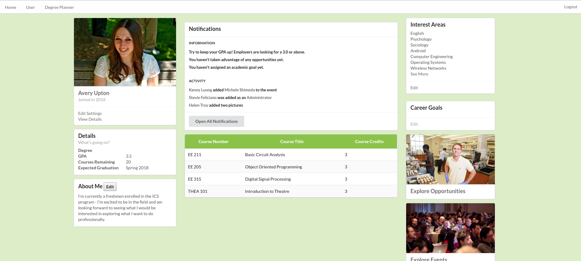
The user page is what you get right when you log in. Most people will be familiar with this format - it ended up being oddly like what your feed looks like when you sign into Facebook.
Here, anyone should be able to edit their profile and edit the interest tags that are associated with your profile. I was directly responsible for this page and tried to make it a little less website-like.
For example, clicking on the ‘edit’ link for interests areas
Stack
Here is technical stack that we used:
- Meteor 1.3
- Blaze for Layouts
- Semantic-ui
- FlowRouter
Overall, I was pretty happy with how things turned out. Meteor 1.3 includes support for modules, which came in useful towards the end when I started adding more and more code.
Originally for our visual mockup we used MaterializeCSS - I ended up liking semantic-ui much, much better than Materialize. Don’t be wrong, I think the guys who made Materalize did a great job, it’s just a little less farther along than Semantic-ui is. Sementic-ui was just so much more mature and clean than Matieralize was. I’m happy we ended up choosing this.
Lesson Learned: Design is Hard
I definitely felt my brain hurting a little the next day every time I tried to do any design stuff. It’s interesting how good some people are at visual ‘stuff’. I’m horrible at it, but I admit I probably don’t apply it enough on a daily basis to get good enough at it.
Proper design is critical to building applications as well as engineering - good visual design included when necessary. And for a student-facing application, I believe that good visual design would be essential for the application.
Lesson Learned: New Technologies Take Time
Okay, so at the beginning we were like all of the other groups who wanted to push forward with using React for rendering the views. Unfortunately, around two weeks in after much fiddling from me, we decided to abandon React and try to move forward instead with Blaze. Using new technologies takes time! There was a bit of a risk for us and we knew it.
We also did have to spend quite some time re-building our mockup using Semantic-ui. This burned about a week or so since we wanted to fiddle around with the previous template and make sure that things looked okay before continuing. Looking back on it, it might have been much better to just start doing the re-design from scratch.
Lesson Learned: Data is King

One of the early things we did was create a bunch of example personas and users for the application. Although this was horribly boring and time consuming, it was immediately useful to us when we were building the application. Without sample data to play around with, we would have had no idea what to build our application around. The sample data gave us some structure to mold things around.
I usually take a similar approach with my rails applications - I make sure I have some structure before continuing. It’s also very useful to have some sort of metric to measure yourself while you continue forward. If you have sample data you can look back a say “oh, that looks a bit right” or “oh, that’s completely wrong”.
Final Words
Most of my web application experience before this was primarily in ruby on rails. Although I still somewhat prefer the Rails way of doing things I realize that Meteor is a great way to compromise if you want something that feels a little more like an application straight off the bat. I was surprised how fast the front-end of the application felt for a complete framework.
Unfortunately, if you’re building traditional web applications you don’t get that immediate speed boost since things need to be rendered on the server and sent all the way over to your computer.
Overall, I enjoyed the experience and highly recommend you try it as well!