Full Scale Mockup Train
So for the past couple of weeks, I’ve gotten the chance to appreciate how hard it is to actually create software. Unfortunately (or fortunately), design is something that takes time to do and learn. Fortunately, at this point in the design stage we didn’t have to worry about any functional parts of the application. It makes you wonder how things can get done if people have to worry about both the programming and design side of software. Is it even possible?
But anyways, my team has been on this full scale mockup train for about two weeks now and I have plenty of lessons learned from that unique experience.
Stop 1: Design Central Station
This lesson is probably obvious for a lot of the more seasoned people out there, but design takes time. It takes time to make things, and it takes time to learn how to be able to make things properly. Design sense comes from experience. Unfortunately, students usually lack experience, therefore students need to remember to budget enough time for the lack of design experience.
Also, design is probably one of the terms used the most but that the least amount of people understand. You can mix design and engineering together, in fact, if you consider what the definition of design is, it’s obvious that design involves everything together:
Designing often necessitates considering the aesthetic, functional, economic and sociopolitical dimensions of both the design object and design process.
So even though we were tackling some visual design elements, we also had to consider the overall design of everything else. Visual design can’t happen in a completely sterile environment, especially when there is a functional system below to consider and a social environment above to cater to. That’s difficult!
Stop 2: Color Town
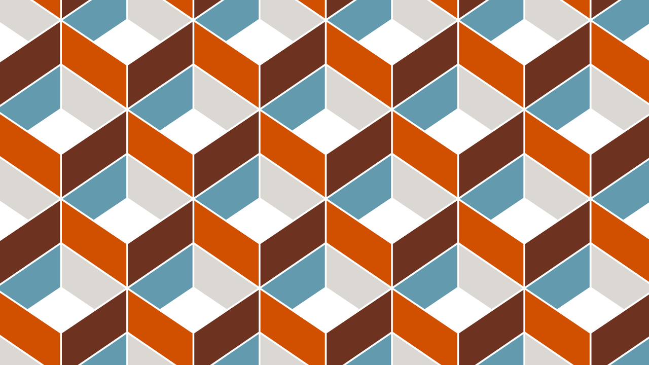
Unfortunately, we didn’t do so well in color town. We did pick some pretty hefty colors in the beginning, and we paid the price later on. Here is a sampling of some of the colors from the landing page that we built:
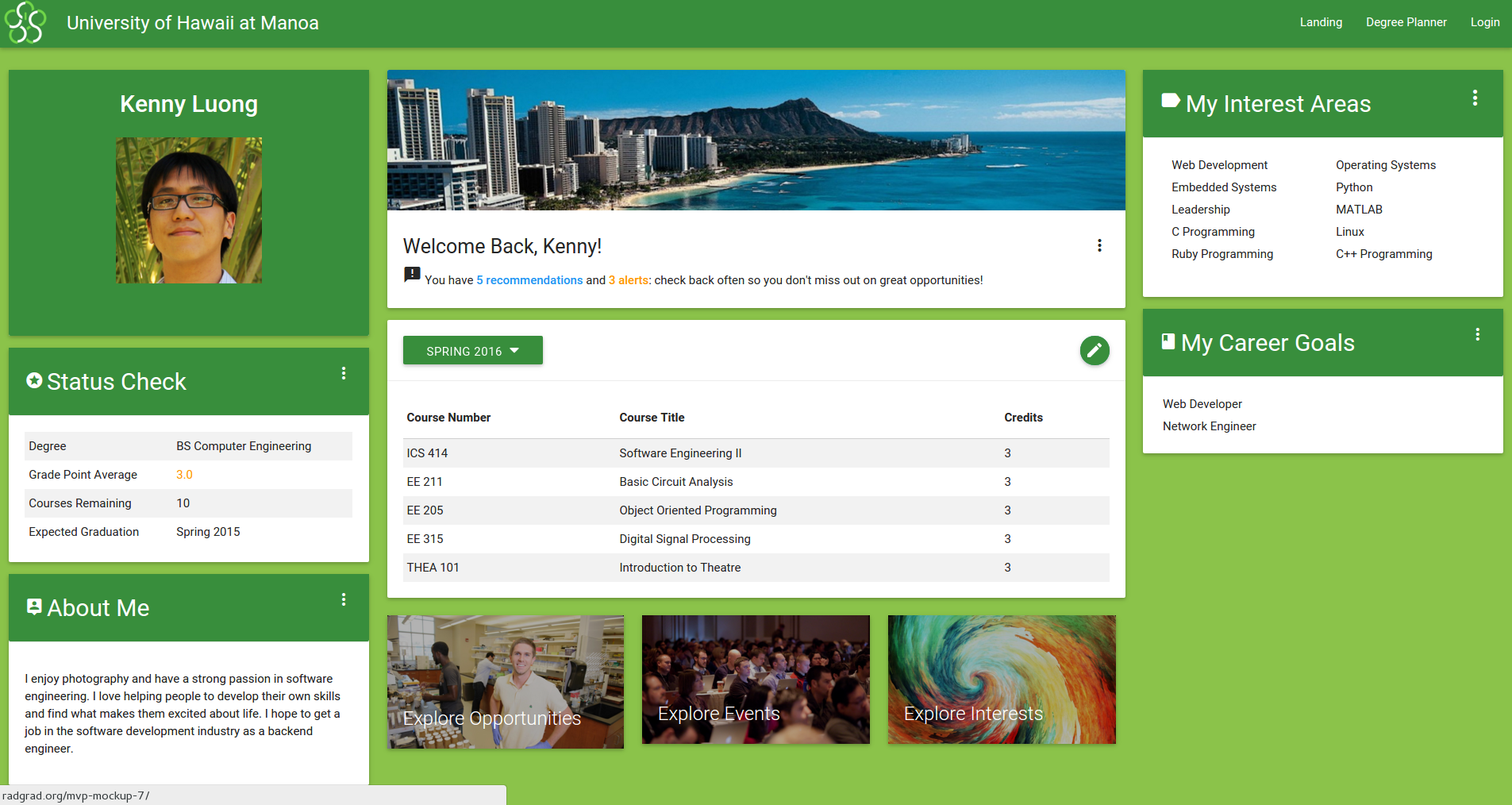
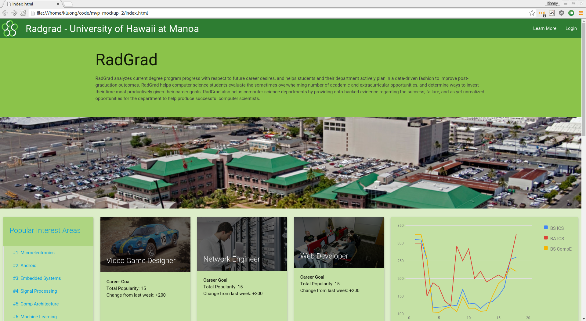
Soon enough through the process, we realized that the colors that we chose were actually pretty hard to work with - we had to spend a lot of time making sure that things looked pretty decent. It was a great exercise, but I think next time it might be worth it to consider some more neutral colors. Here’s what two of the other interfaces looked like so you can see how we tried to work the green in:
There were definitely places where it worked nicely. I think the sky blue of the picture on the user dashboard worked very well, although you might think it’s hard to just start putting islands everywhere.
Looking back it, referencing a color theory page like this would have probably helped to get some insight to what colors we could have used.
But you can definitely say it’s better than what we had before…
Stop 3: Jekyll City
We’re switching gears a little here - I wanted to talk about the one positive thing that helped over development cycle: Jekyll. Most of my group wasn’t familiar with Jekyll, but they were nice enough to play along with it anyways and it worked out well.
One of the things that happens when you’re working on one HTML mockup is that changes tend to block one another. Waiting for someone to make a change on a branch or something was a pretty common occurrence and without Jekyll it would be a little harder to make changes.
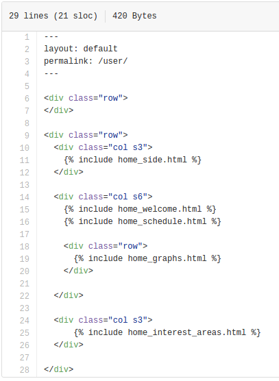
With Jekyll we can use include directives to separate out our code and make things easier edit.
As long as the general layout was put down.
As an example, here’s what the HTML looked like for our homepage - it’s really short:
Stop 4: Final Results
So overall, while the results could have looked better, I think anyone can take this as a learning experience and move forward. Design is really difficult (at least for me), and I think that I’m slowly getting better at it by being exposed to these kinds of environments.
Honestly, the hardest page we attempted to create was a type of ‘degree planner’, where undergrads would be able to plan out their semester schedule. Here’s the end result, but it was a lot harder to resolve to this than you would think:
Even with feedback and examples from other teams, it took a while to understand what needed to be on the page and how to implement it. We definitely could have discussed it more, and I had the unfortunate change of being sick at the same time as this last module was being built so it was even tougher for me.


