
Utilitarian Material Design Examples
In the past I’ve found it very hard to come up with inspiration for nice looking user interfaces. I talked a little previously about what material design was, and how it might be helpful – now I have a list of a few interface examples that might be helpful when starting to build an application.
I built this list in the context of creating a user-facing application that will be used as a planner as well as a social network. I’m referring back to that RadGrad application I was talking about earlier!
Let’s dive in!
Material Dashboard
<img src="/assets/material-design-examples/dashboard-1.png"></img>
This one was a great start - it highlights a dashboard with some graphs and charts. I guess it’s still pretty generic looking, but the general structure is there - it’s trying to convey some statistics about a system. This might be useful to look at in an application where you’re trying to design a landing page which displays data about your system.
Materil Angular Theme
<img src="/assets/material-design-examples/dashboard-2.png"></img>
<a href="http://flatfull.com/themes/materil/angular/#/app/dashboard">
Source </a>
I actually like this one much better than the previous example. It’s cleaner, and includes a list of activities. If you’re building a social networking-type of application you’ll need a way of displaying what’s currently happening to the user. This could be useful for a home page for the user where the user can get a quick status check about themselves.
Login Screen … Clean!
<img src="/assets/material-design-examples/login-1.png"></img>
<a href="http://codepen.io/yusufbkr/full/RPBQqg/">
Source</a>
I included this example because I thought it was very visually pleasing. I’m a big fan of these types of login pages because it’s clean. It doesn’t provide any information that isn’t needed - it tells you to log in, and that’s it. Of course, if you’re building a user-facing application you’ll need to consider if this type of login screen is for you. For RadGad, I would love to have this sort of login screen - it could possibly people to sign up for the application and get access to the information from the home screen.
Our First Graph
<img src="/assets/material-design-examples/graph-1.png"></img>
<a href="http://www.materialup.com/posts/stats-card">
Source</a>
This is a component that might be good to include if your application is especially driven by data. If you have a landing page that has to display statistics about something, it might be good to use something like this. The advantage of going with the card-based route is that you can make things a little more modular on the page and split up the content for the user.
An Invitation
<img src="/assets/material-design-examples/invitation-1.png"></img>
<a href="https://dribbble.com/shots/2488769-Google-Calendar-integration-concept">
Source</a>
THis is a component that would be great to include for a page where you need to display some sort of events. If you had an application where users had to plan or schedule events, it might be good to include a place where users can see their most recent events that might be occurring.
As a tangential thought, this component also might find some good use in notifications for a page.
Profile 1
<img src="/assets/material-design-examples/profile-1.png"></img>
<a href="https://dribbble.com/shots/2494012-Arsenal-Player-Redesign">
Source</a>
I enjoyed looking at this example - it’s a very visually striking profile description page of someone. This example might find some good use in user profiles but depending on your demographic your users might not look as good since they’re not all-star athletes.
Instead, I think this type of design example would be better suited for a catalogue or something. A career listing or course listing for a university might be a good place for this type of design. It’s striking enough that it would draw users in, but has enough space to give users a good introduction to the topic, course or person.
Another Graph!??
<img src="/assets/material-design-examples/graph-2.png"></img>
<a href="https://dribbble.com/shots/2487326-100-Days-Sketch-UI-Contest-day018-Analytics-Chart/attachments/487843">
Source</a>
I wanted to highlight this graph particularly because it makes a comparison between two things. This would be very appropriate if you want to display a comparison to users. If you needed to tell a student “hey, this is where you’re at in comparison to other students in terms of progress”, this would be a great way to do it.
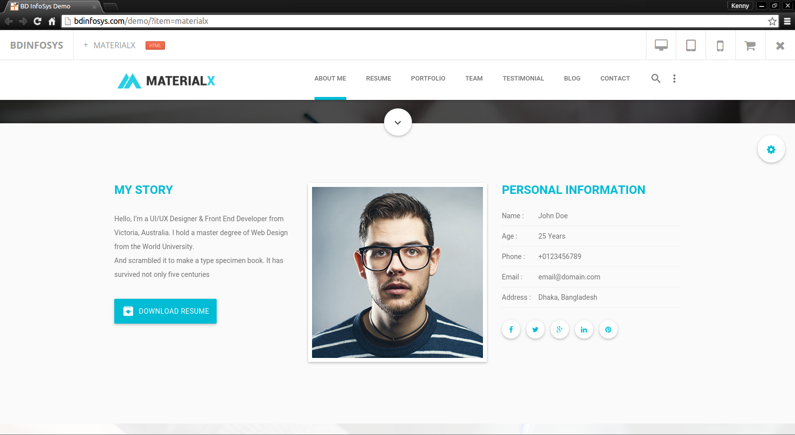
A Better Profile
 </img>
Source
</img>
Source
The last profile example wasn’t so great to have as a user profile (sorry), but this one is. It has all of the user’s basic information as well as a portrait. If having photographs are important to you (as they are in social networks) this design has the advantage of having the user’s profile front and center on the screen.
This design doesn’t skimp on any information though, so it would still work well if we needed to add more information.
Scheduling
<img src="/assets/material-design-examples/calendar-1.png"></img>
<a href="https://angular-material-calendar.bradb.net/#">
Source</a>
I threw this one in because if you have your users do any sort of planning you’ll need a calendar. It doesn’t have to be the main view, but it would be great to have this view as an option for users.
ANOTHER Dashboard
<img src="/assets/material-design-examples/dashboard-4.png"></img>
<a href="http://www.shamalasuresh.com/material-admin-google-material-design-responsive-admin-and-dashboard-bootstrap-theme/">
Source</a>
Kenny - stop giving us dashboards, do you have a thing for dashboards or something?
But this one provides us a different perspective than the ones that we saw before, and it goes even more into the material design feel than the previous example. Because we don’t for a user dashboard, this is clean and displays the one thing that might be most important to the user. If you’re a designing an accounting application you might display the current state of the most important account, for example.
For a student-oriented example, you might display “progress” that is measured in some term.
Progress!
<img src="/assets/material-design-examples/progress-1.png"></img>
<a href="http://angularscript.com/dynamic-round-progress-bar-angularjs-svg/">
Source</a>
This one I thought would be good to include if your users need to complete things. It’s oddly reminiscent of the progress bars in games telling you how many challenges you’ve completed. Students at a university might want to see how many skills they’ve learned to make their career goals.
Chips
<img src="/assets/material-design-examples/chip-1.png"></img>
<a href="http://refork.com/x3cc">
Source</a>
One thing I think is important to include in applications that have catalogues of data that are available to users is tagging. Apparently the graphical “thing” is called a “chip”, so we’ll go with that.
Chips would be useful when people are exploring something, or trying to plan something. Stackoverflow has a great example of this - when you want to add new content to your feed you add a new tag via a “chip”.