Paper Design Flow
<img style="border:1px solid black; width:50%" src="http://s3images.coroflot.com/user_files/individual_files/original_452896_fzVxIByg59Pj384FL_LkwAFAc.jpg">
</img>
Disclaimer: I’m a huge fan of coloring books and will never turn down the crayons at a restaurant.
I think that there will always be a place for paper as a medium, regardless of what kind of technological changes happen. Just like how the programming language can influence the creativity of the programmer, the medium for art can influence the artist just as much.
As such, I think it’s still useful for some design to happen on paper. I find it also funny that Google sort of “settled” down into their material design philosophy - maybe some of the designers in Google realized that most people are looking for physical familiarity. Physical just works, and I think paper works as well.
RadGrad
Dr. Johnson asked us to help prototype some user interfaces for RadGrad, so I thought I would use this as an exercise to explore the paper design flow.
So what works and what doesn’t? Why even bother trying to do this at all?
Flow
The technique that I used was borrowed heavily from Dr. Johnson’s technique - I like bottom up approaches because in general that’s how I learn. I get some details and then I start to lump them up into concepts afterwards.
So this is what I did:
- Write down the page title
- Note the audience
- Write down some core concepts that are important for the page
- List down some more details that would be good for the page
- Do a quick sketch
- Start detailing components on the next page (colored!)
Results
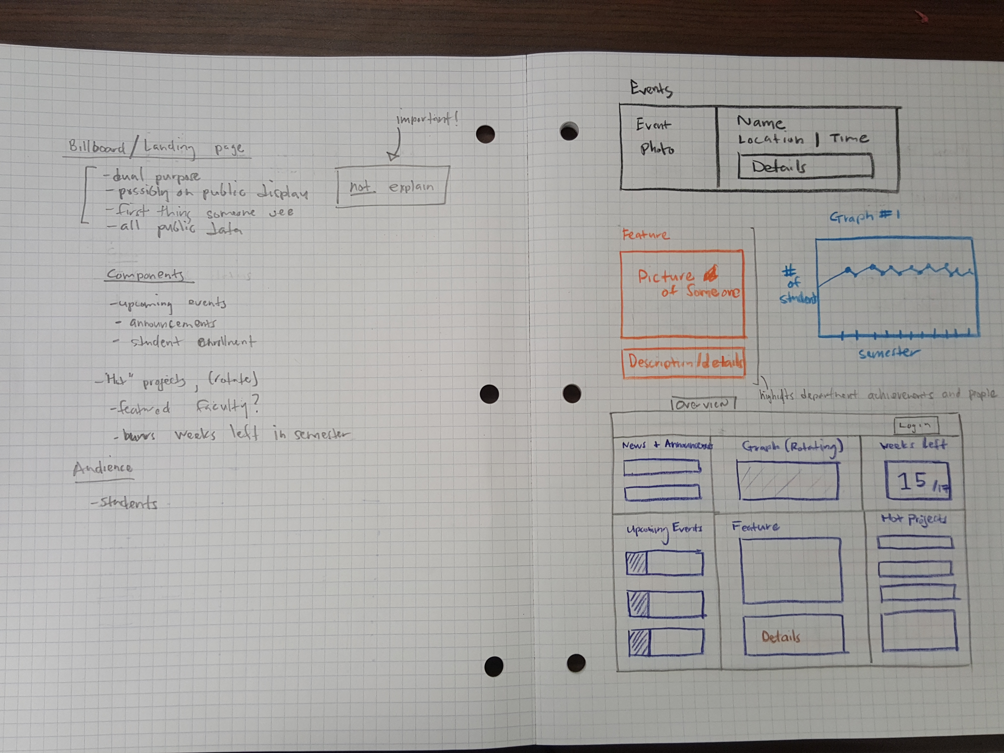
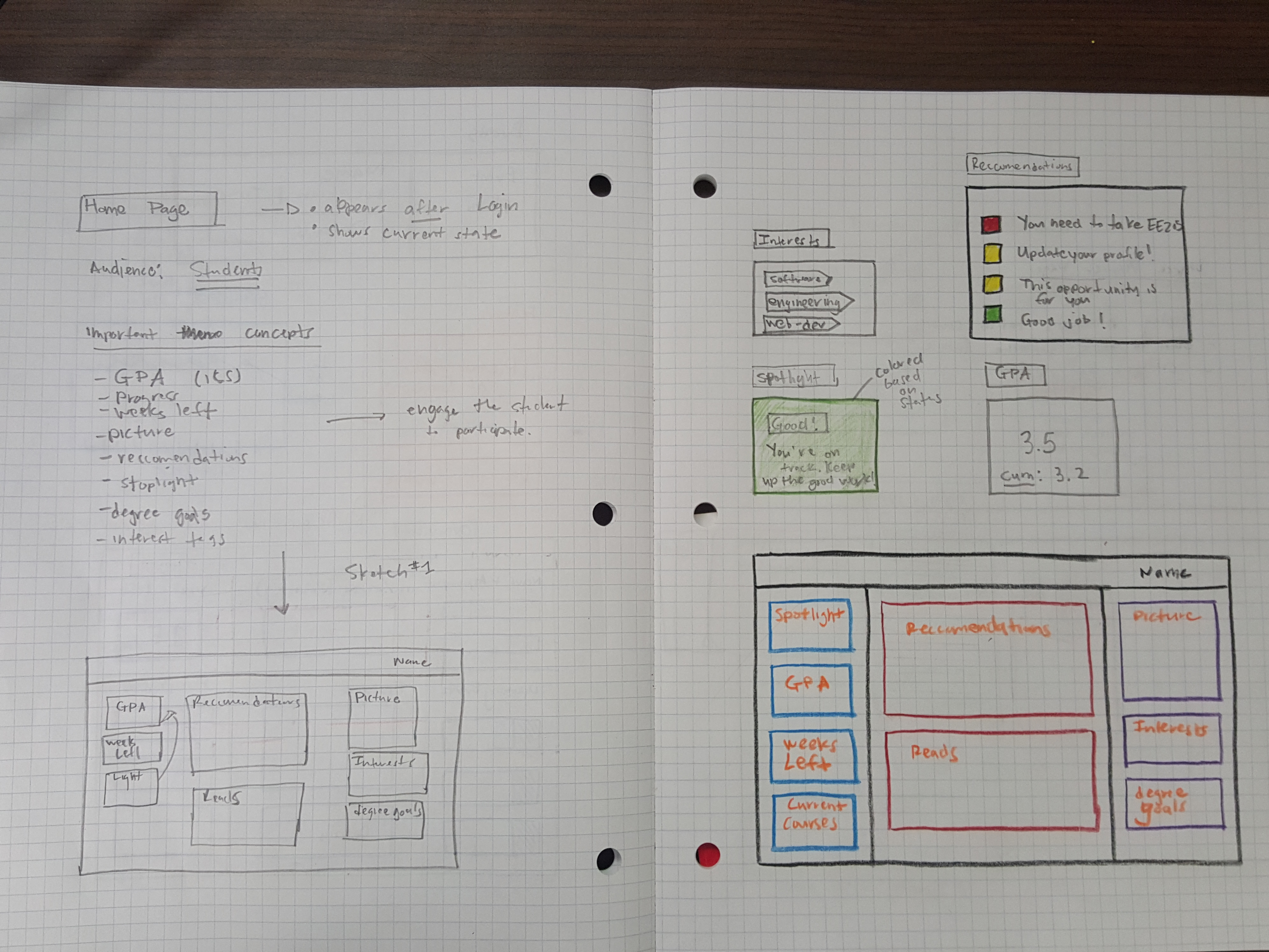
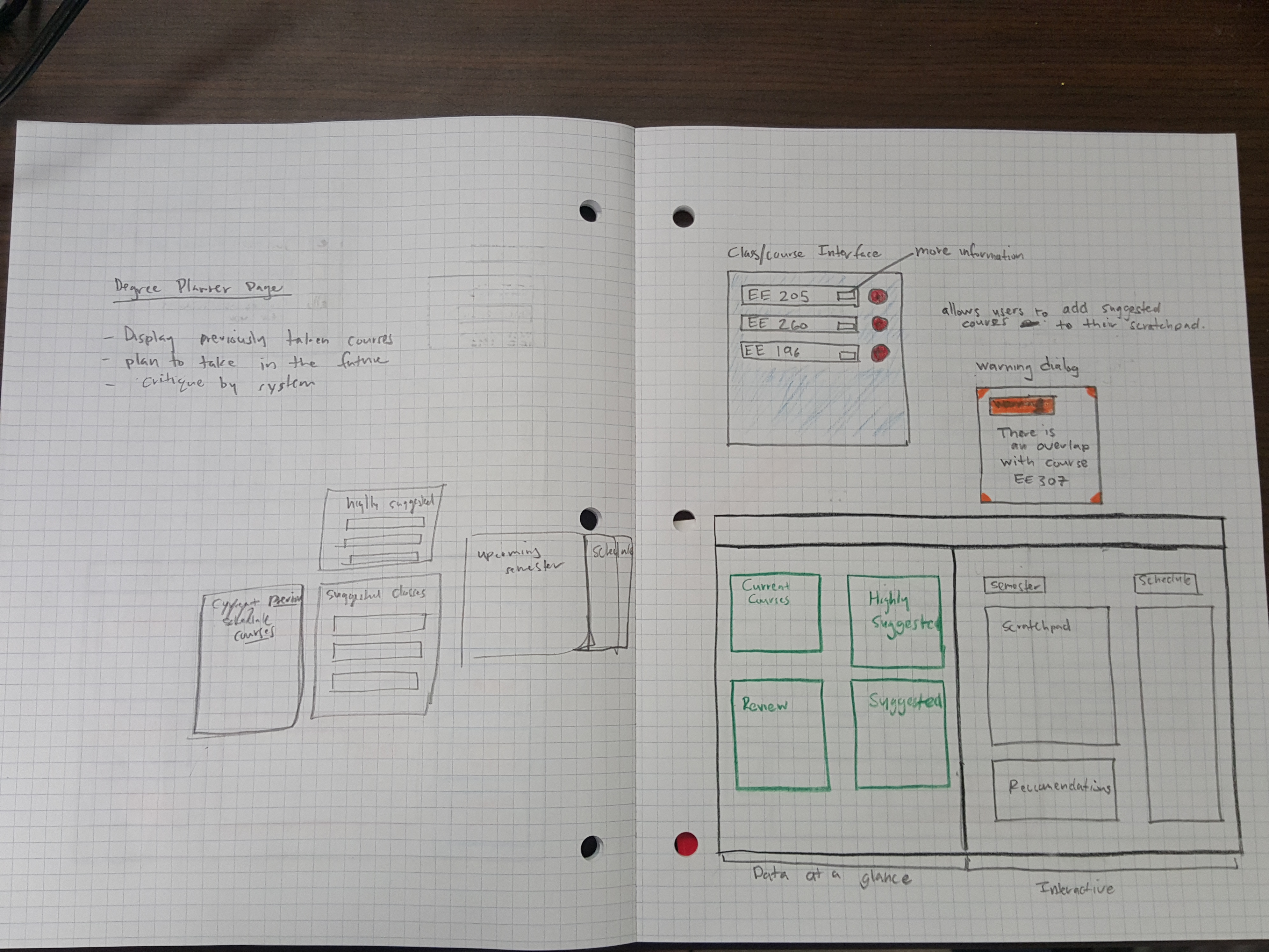
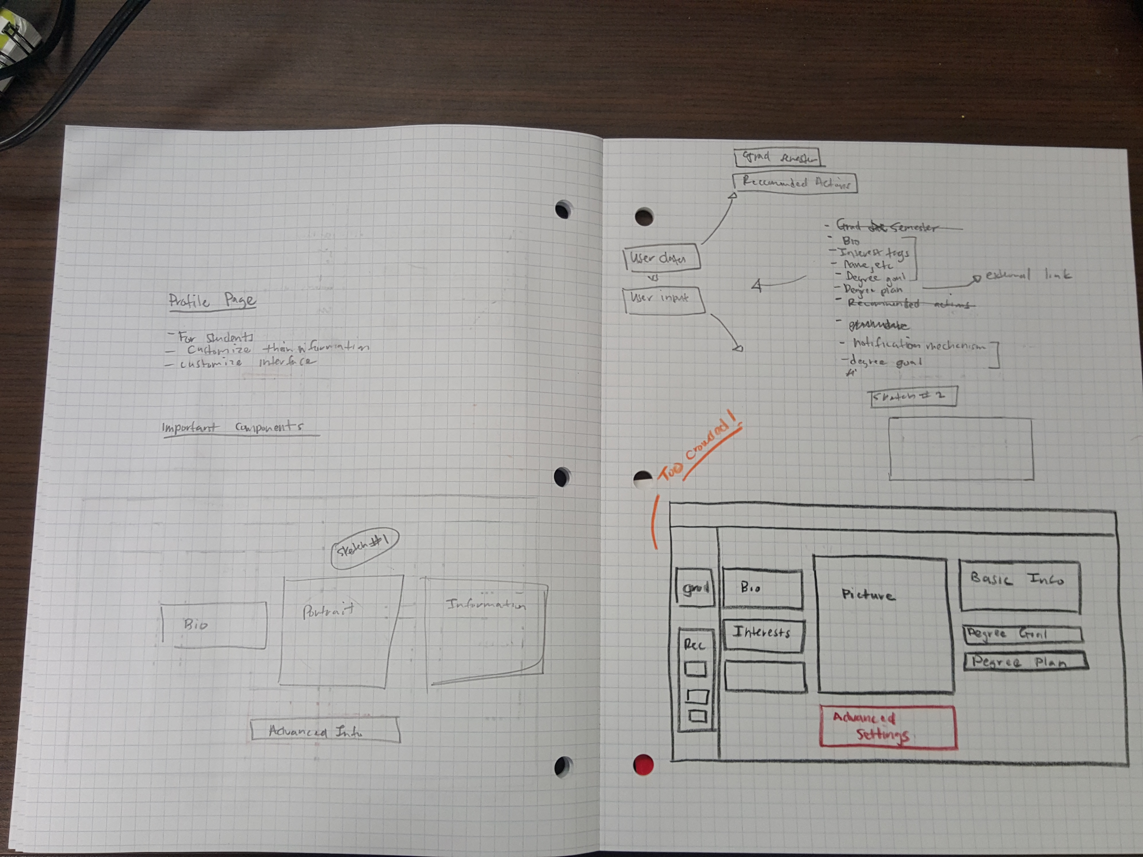
So here are some of my results - I came up with a few different pages that might be useful for the radgrad application.
Landing Page
 </img>
Home Page
 </img>
Degree Planner
 </img>
Profile Page
 </img>
Slowness and Iteration
One of my theories of why this still works is because it helps you to slow down and think about what’s happening. Art classes (at least the beginner ones that I’ve been to) are run in a similar fashion, students are guided through small exercises and are encouraged to focus on the correct concept.
I noticed while going through this exercise that I had plenty of comments for myself while I was creating things. Concepts that seemed to work in my mind didn’t actually work that well on paper. Or I had the wrong ideas and needed to change things. This was the case for the profile page, where I really underestimated the amount of things that I needed to put on the page.
But it’s okay! Mistakes are the fruit of life - you take them and move forward.
Will I try this again?
Yeah, I’ll try this again. At the very least, it’s a very good exercise.
A final thought - Artists stream (or condense) their art workflows for viewing - I wonder if there’s any equivilent for software engineers?
