
After Paper Mockups
I always thought most visual things were really hard for me - today I prove that it’s still hard for me to make something look nice! Granted, this particular exercise was for a class but I still attempted to do my best to flex my mental design muscles.
I talked a little before about paper prototyping - I think it does help to some extend but ultimately you won’t know what you’re prototyping on paper unless you’ve spent some time doing actual design in CSS and HTML. I fully intend for the contents of this post to show up at a (potential) roast later on in the future.
The Goal
The goal of this exercise was to build a landing page that would show off a system - not necessarily a full marketing page, but something like that.
First Attempt
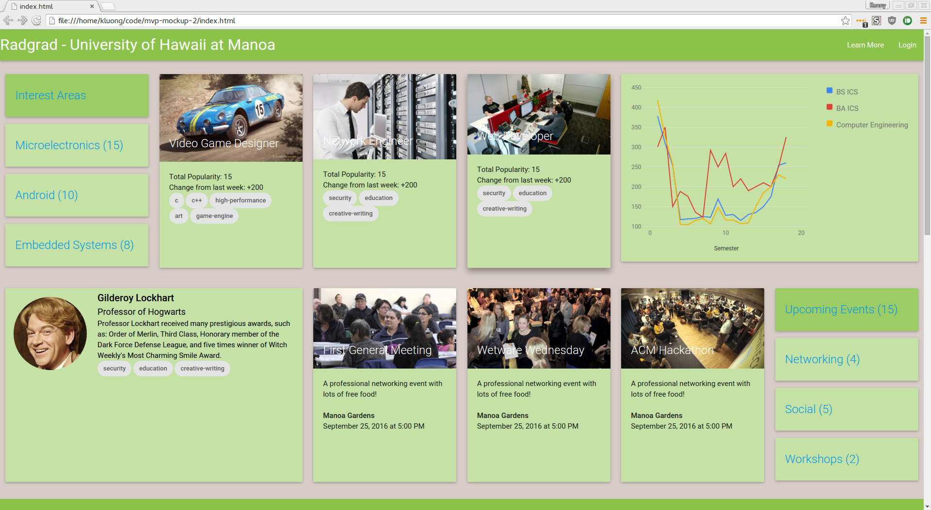
What I tried first was to directly map my paper prototyping solution onto HTML and CSS. My team at this point hadn’t jumped on yet so I decided to give it a shot and see how things would look like if I tried to follow things a closely as possible. Here’s what I ended up writing:

Ew :(
At this point, I realized that we would have to fundamentally think about the CSS mockups in a different way. I was too new at design to be able to come up with a proper paper prototype that takes into account all of the real factors. Back to the drawing board.
Changes
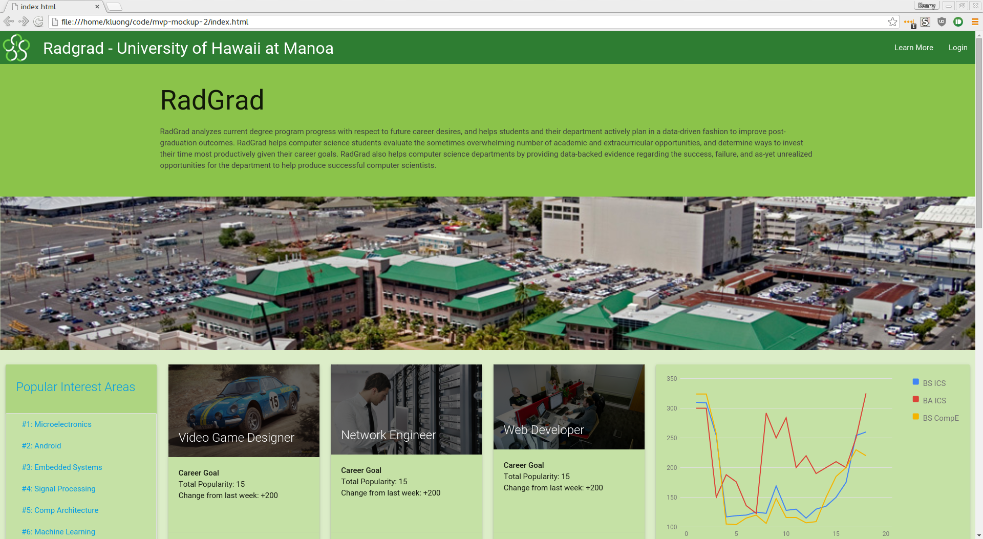
One of the ideas that we really tried to keep in this particular mockup was making sure that the data had an active role. This site wasn’t just for anyone - it was meant to draw in students with it’s value. The site therefore could benefit from having a UI that would make it immediately apparent that there was some activity going on.
I didn’t want to concede to defeat and completely scratch that idea so I pushed ahead and hoped that we could come to a resolution. Here is what our next attempt looked like:
Some More Changes
Our last mockup was riddled with bugs and could have used some more work so we took another shot at it:
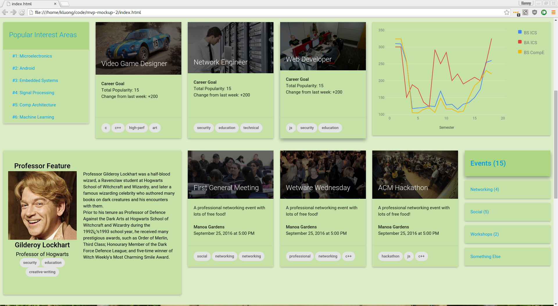
Definitely wasn’t my proudest work but it was probably the first time I’ve prototyped something up seriously. I admit it was quite the challenge for our team to do this exercise.
Lessons Learned
Design is difficult and takes time to learn. That’s part of what people talk about when they mention that programming is an art - you have to learn these lessons slowly and over time. If you’re new at something, you’re going to be bad at it. In my case, I’m still pretty new, so I’m really bad at making these sorts of decisions.
I do however, like the challenge and the opportunity to grow.
KISS (keep it simple, stupid) - This piece of advice seems to get repeated all over the internet for a good reason. It works. I have a tendency to make things a little more complicated than they need to - in this case we might have added too many things on the screen.
I also thought that there was a great opportunity to use Jekyll as a prototyping tool since it reduces the number of things you have to re-type. It’s easy enough to get setup and it might work for teams that are working on things as well. As we were progressing through the mockup, I kept feeling the struggle of having to redo a lot of the boilerplate that we had filled with our own content.
Keep at it
So for all of those out there who are feeling the struggle - my advice would be to keep at it! Try your best to do good work and you’ll learn lessons regardless if you fail or not. As you can see, we didn’t do so well here, but are taking it as a learning experience to move forward.