Real World Usability Testing
If you’re a computer science or computer engineering student you’ve probably had to do some usability testing at some point. But maybe you’ve never taken it that seriously because it didn’t seem that important. But if you’re building something, it is important to get some testing at some point. We’re all human, and unfortunately, if you’re doing a creative task odd are it’s not perfect the first time around.
RadGrad
So for the last four weeks, we’ve been cycling through our mockups for Radgrad - it’s basically a software platform that will help give computer science and computer engineering students a good breadth of experience and skills in an ever-changing technological landscape. If you’ve never heard about it, feel free to head over to my first blog.
Anyways, we’ve been building this thing for weeks and to get to the next phase (building a minimum viable product) we needed to do a sanity check and make sure that we’ve made something people actually want to build. Honestly, most of us were pretty tired at that point and we welcomed the break from learning and iterating.
The Plan
In general, this was our workflow for the usability testing:
- Sit users down, explain procedures
- Commence test (use screencasting software)
- Take down data from screencasts
- Analyze and summarize data
We attempted to keep our process as unbiased as possible. Our entire team used a pre-written script that ensured that there was at least some consistency between each usability test.
The Data
We split up our data collection an analysis into a few segments - temporal, questions, information/satisfaction and workflow.
Temporal data included anything that had to do with time. How long did users spend on a page? What page did they spend time on the most? What was the average amount of time that users spent on a page?
Questions were obvious but important data points to record. Although our test batch did not have any questions, the questions that they did ask were also asked in other groups. We made sure to go through our usability tests and record the user’s questions.
General comments about satisfaction and information were also recorded. If a user expressed a particular excitement for a feature it was also important to us to note it down.
Workflow was an interesting one that didn’t turn out as well - but the intention was to reveal where the user was drawn to. What pages did they click on first? Did they go back to any pages. Due to the rigidity of our script we couldn’t collect much of this data point.
Some Shiny Results
Okay Kenny, you’re boring everyone again. Show the people what they want – results!
We collected our data and then attempted to organize it in some reasonable way. Spreadsheets, of course were the go-to tool for doing this. It might not have turned out looking that great but here it is:
From this, we were able to extract a graph that shows a breakdown of where users spent the most time:
Findings
Overall, our app wasn’t that bad. Our child of three weeks can’t be that bad right?
But our test users were indeed able to navigate to most things. The joy and relief when a user says “ah, this makes sense”, is a great feeling to have.
Many of the comments however were very insightful to us. When you’re in the thick of things, sometimes you don’t have a good view of the bigger picture. I’ll let one this one speak for itself.
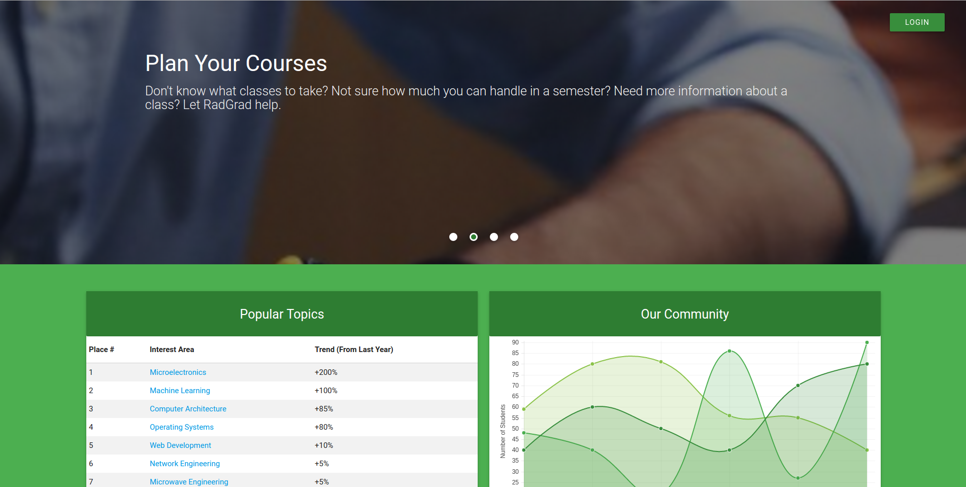
Yes, our landing page is a little long and was a little too much for most of our users to handle. Most of them skipped through things pretty quickly… for the page that was the biggest and had the most content you would have expected users to have spent the most time on that page.
Lesson learned: users do not really want to read long pages, especially when they’re anticipating an app.
A Tool: Screencasting
One thing that was really useful to us that ended up working out was recording screencasts of our usability tests. This allowed us to not have to write down any notes. I highly recommend running your usability tests with screen casting software that can also record audio from your testing computer’s microphone. This is with your user’s consent, of course.
Doing this allows you to focus on being un-biased and attentative to your user - the less it feels like a test, the more genuine the reaction can be.
The Final Verdict
If you want more details, I’ve uploaded the slide deck that my team used to present our findings. There are a few updates that we still need to make to the slide deck, but I figure that I’ll put it up here anyways. I always tell people this - I’m definitely not perfect, and if you can learn from the mistakes I’ve made doing things, great!
Even though there might be a stigma attached to it, I do firmly believe that usability testing can be helpful at least to your own creative process. We all get a little insane when we’ve worked on things for long periods of time and it’s extremely useful to get outside input. Besides, you’re building that app for people to use right?


